-28.jpg?v=63941499597)
-29.jpg?v=63941499654)
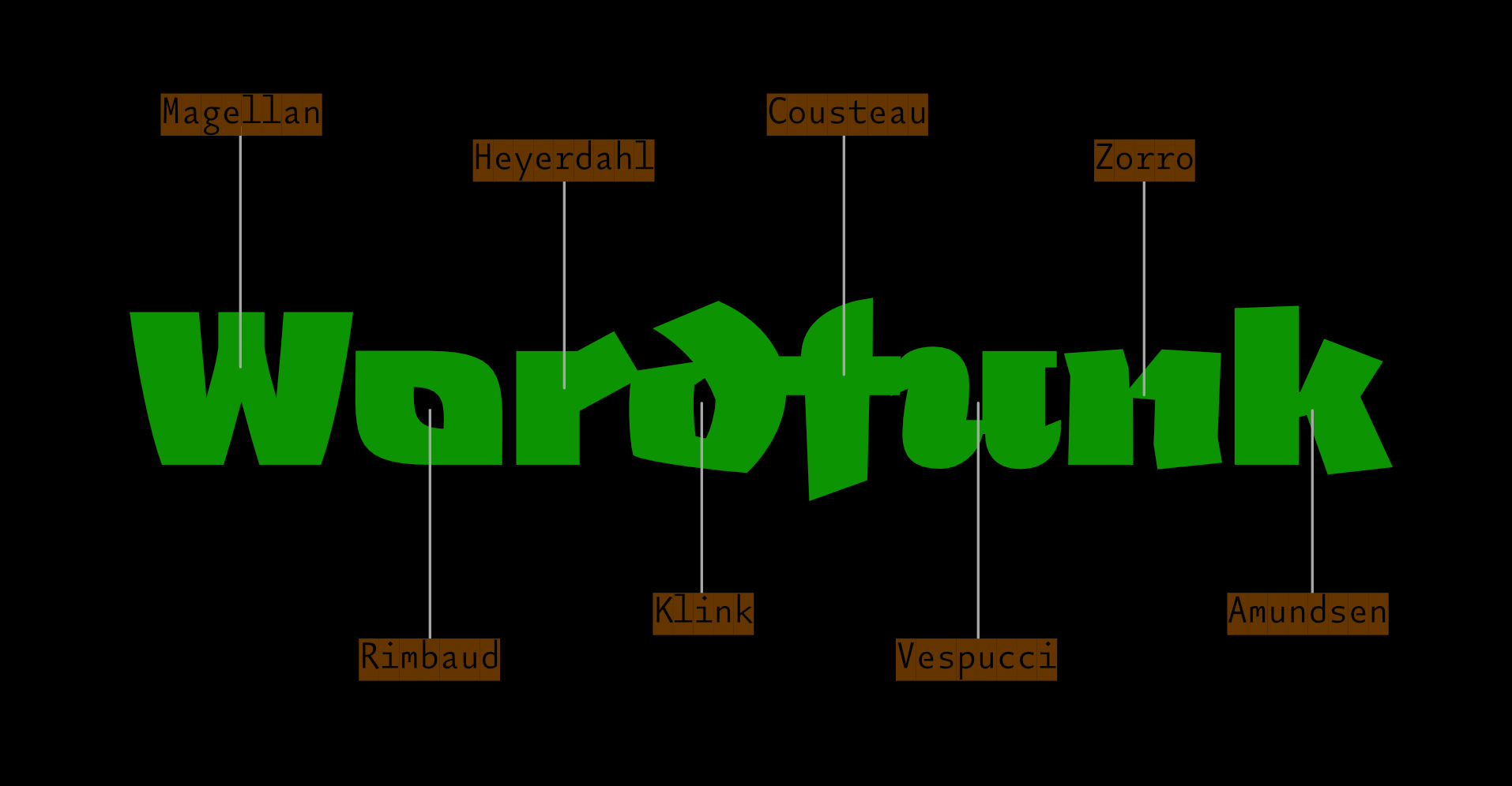
Explorers
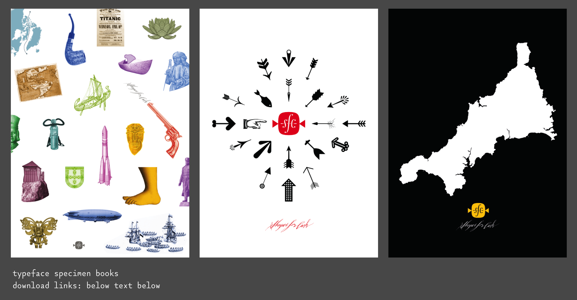
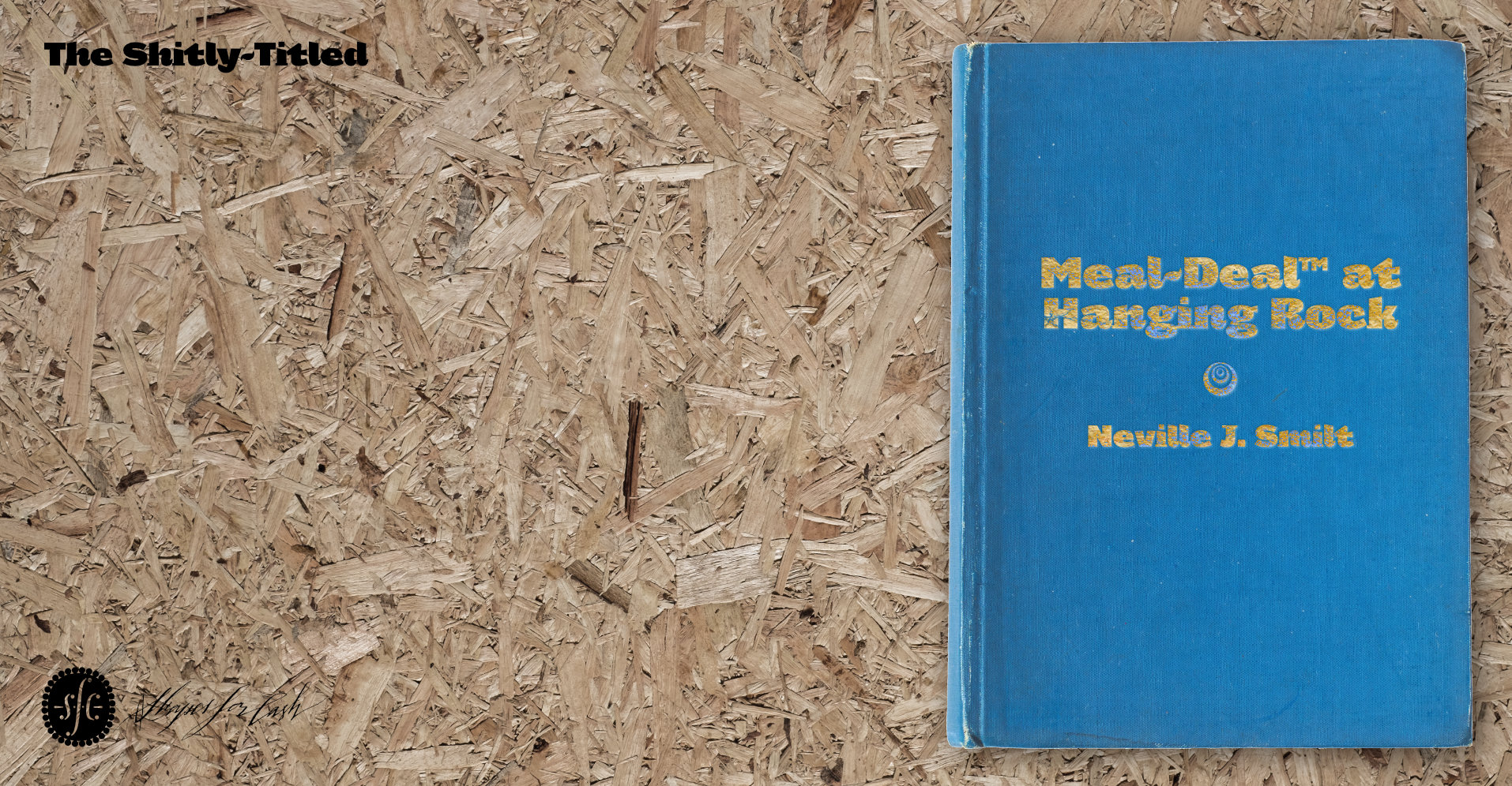
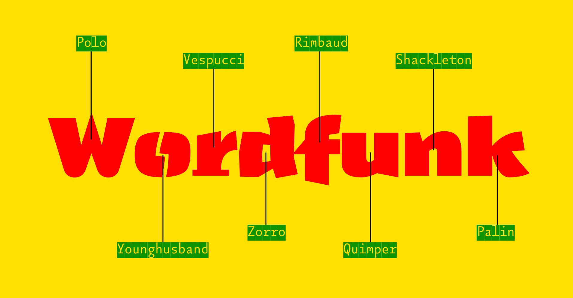
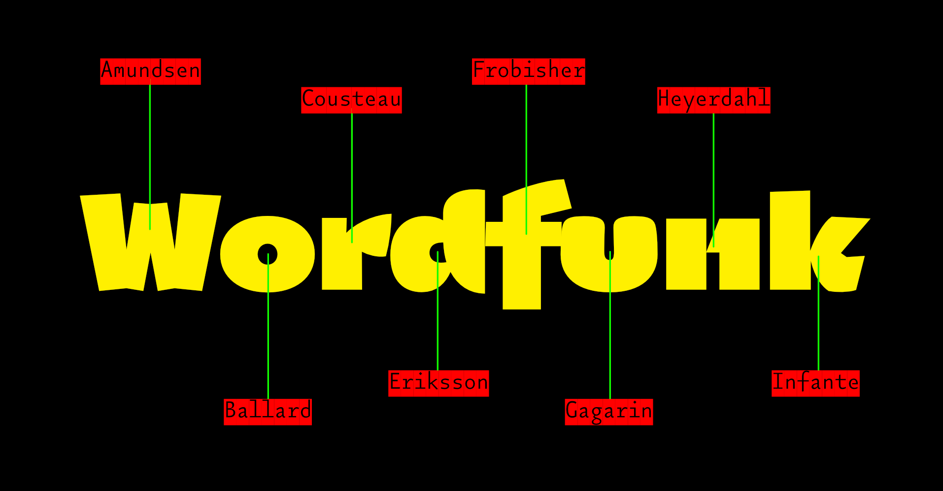
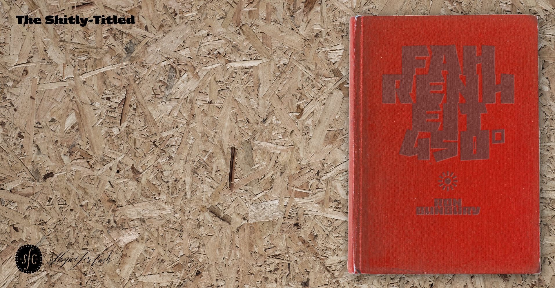
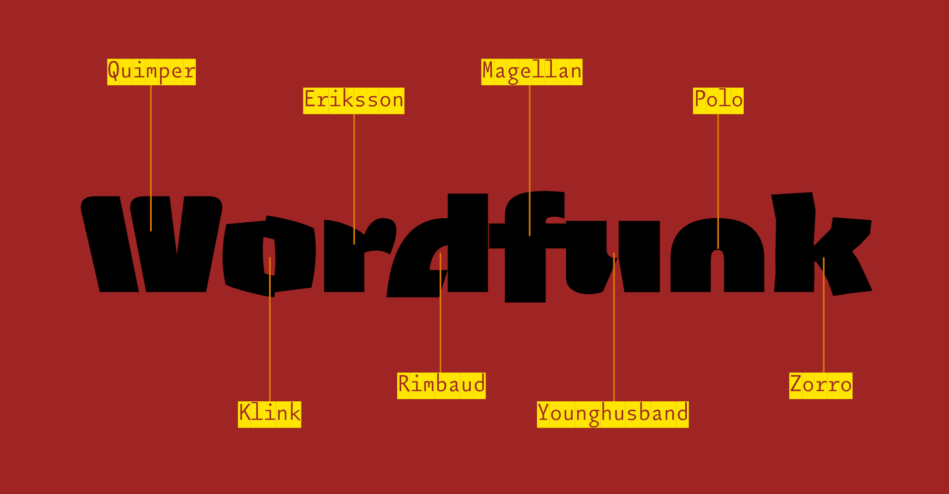
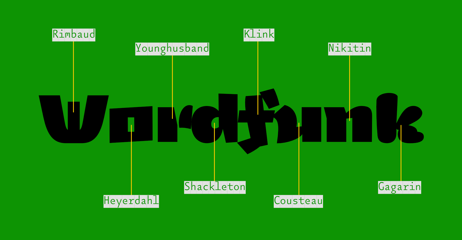
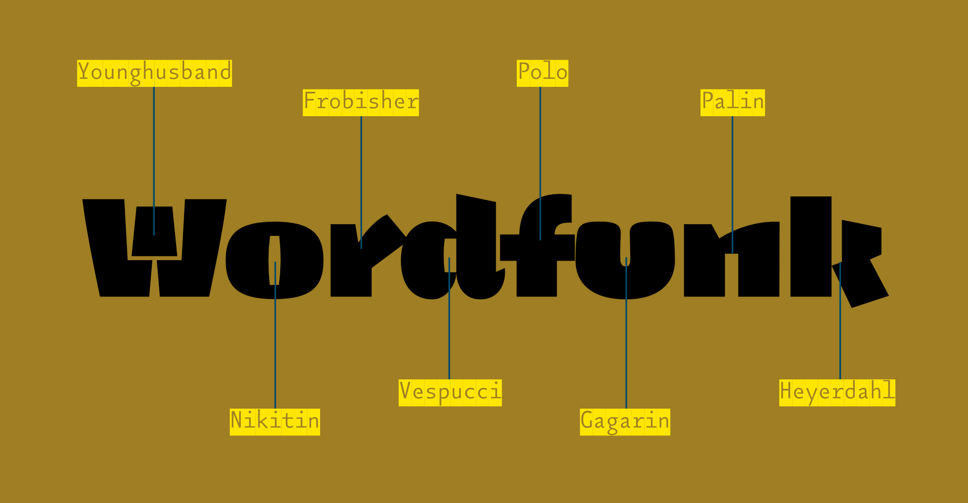
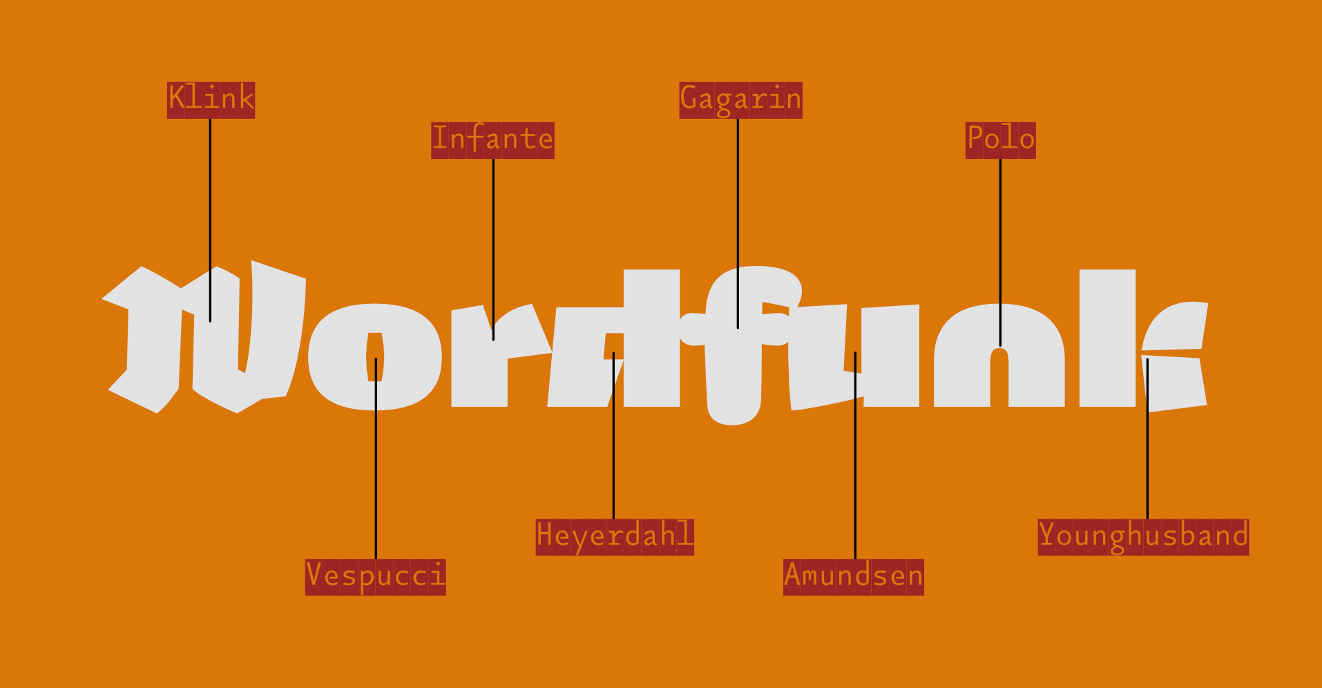
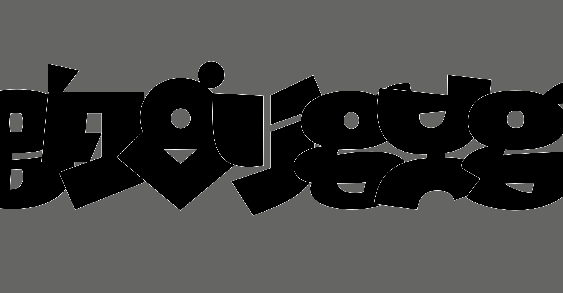
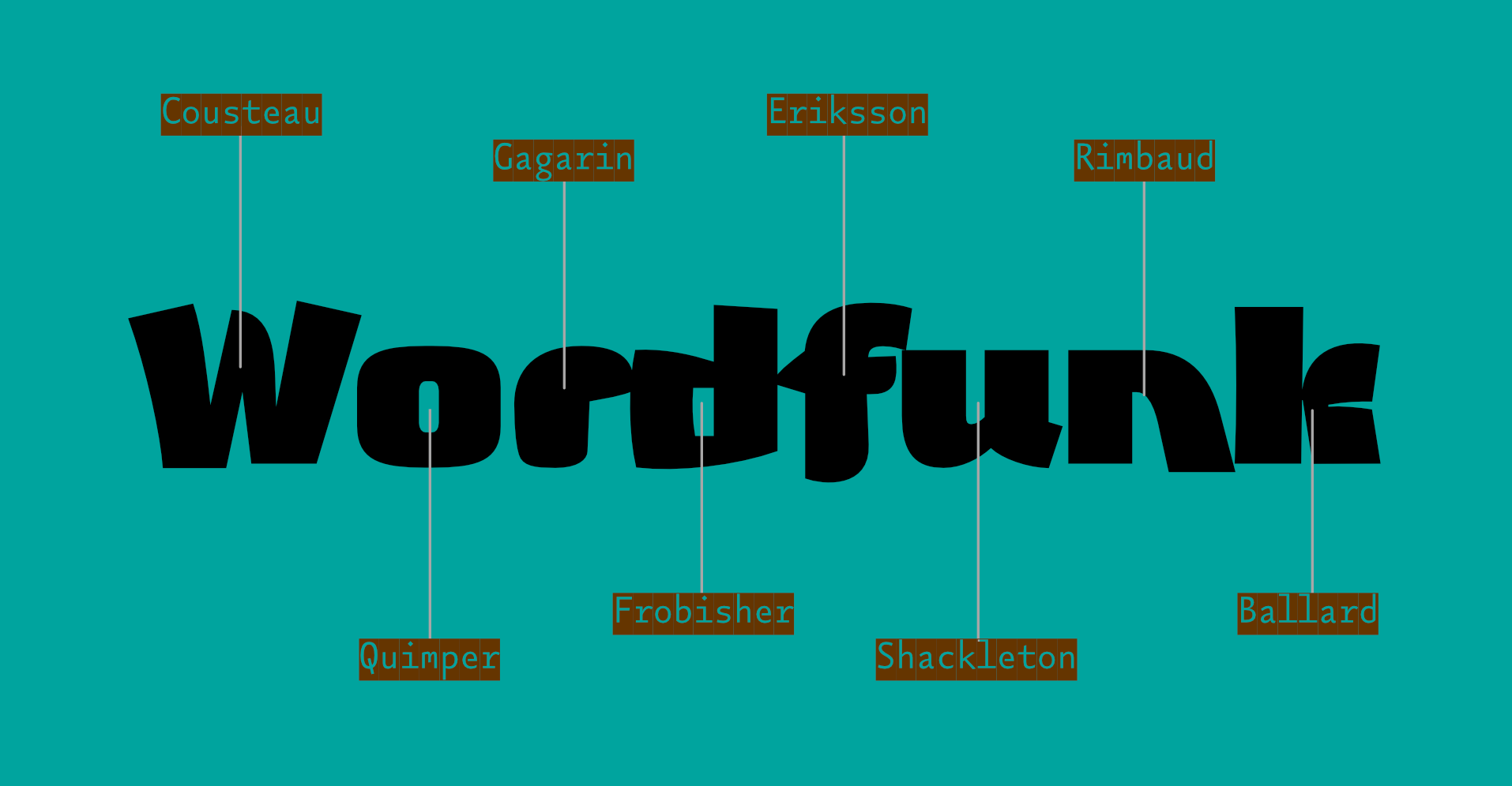
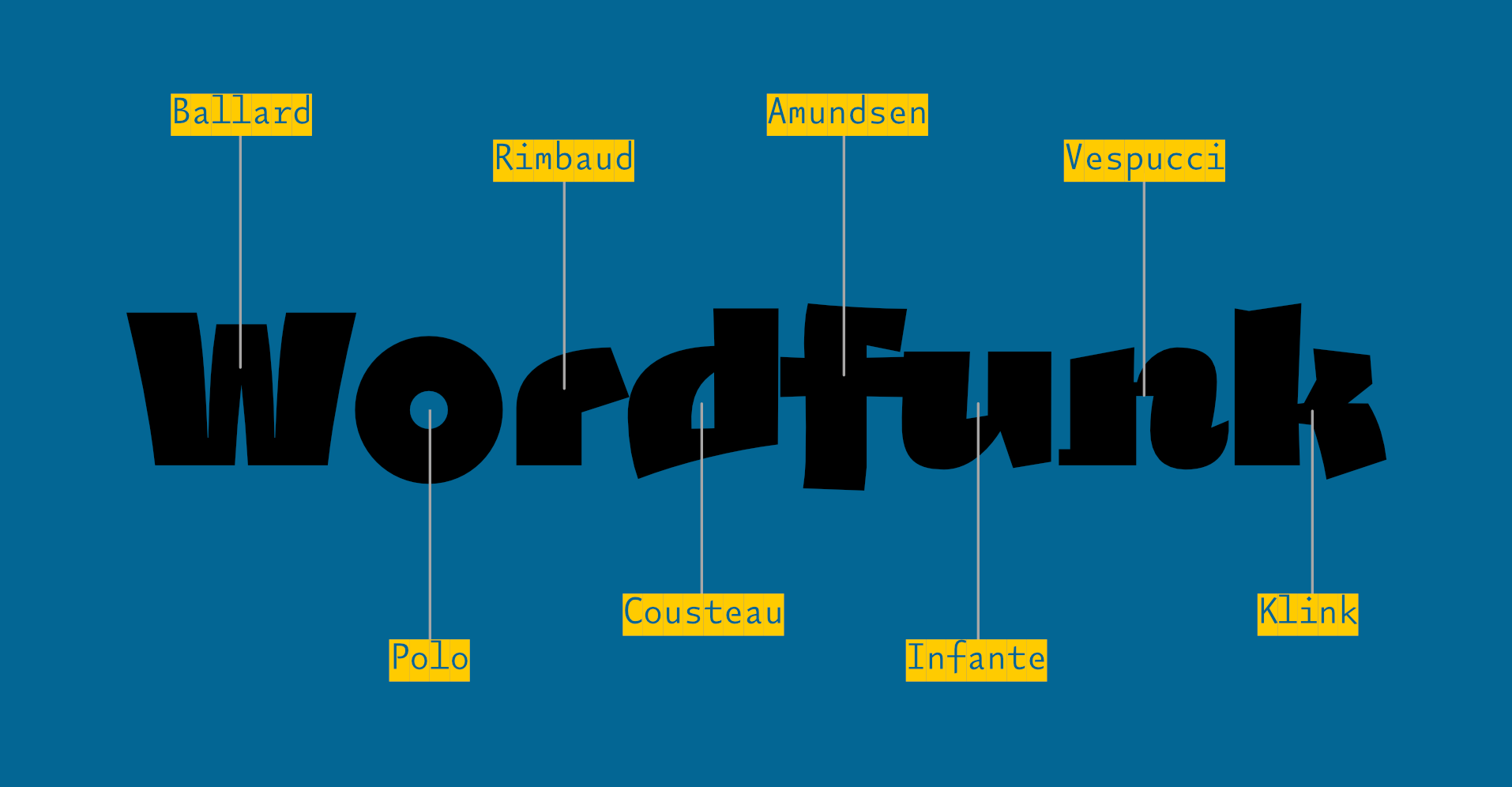
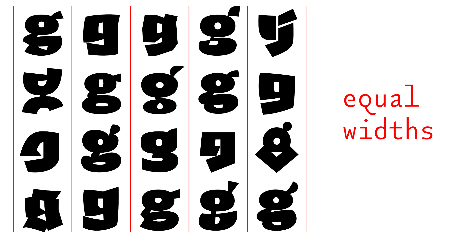
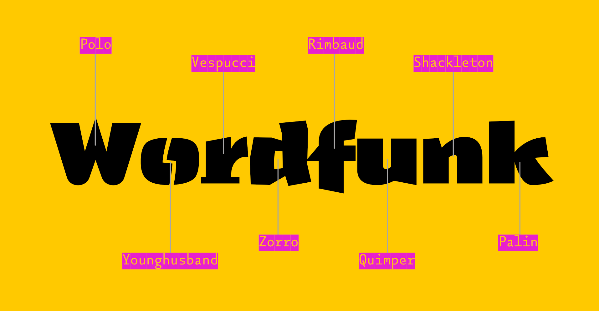
Sometime in the 20th century, I sent a design to the Morisawa Typeface Competition. It won a prize. I called the typeface Vespucci (I suppose I had been reading something about the origin of America at the time.) You will be able to see the original design – as presented in Morisawa’s brochure – by scrolling the gallery above ¶ At a later date, I found myself drawing more fat grotesques, and as I had named a similar design after an explorer, I carried on (sometimes naming a typeface is harder than designing it) ¶ There was no initial plan to make these designs belong together, I was just enjoying the drawing. The collection of sketches eventually grew to the point where a stapler was required, and so it seemed like a good idea to try and impose some order on them. Many of their base characteristics were brought into some kind of alignment with each other, and they were forced to share an x-height and other vertical metrics (extenders [ascenders & descenders]) ¶ The years passed, and I continued messing about. I thought it would be nice for each character in the now 20+ designs to share the same widths, so that they could be interchanged to make some interesting interactions of shape. An A could be replaced with any of the other 19 A’s without interfering with the length of the word. I quickly abandoned this thought, realising the mind-numbing amount of work it would take ¶ Then a friend (Rutherford Craze) made the same suggestion. Oh Dear! ¶ And so it came to pass that I made all twenty a's the same width; and the g's; the R's; even the pilcrows and the spaces, and so on, and so on ¶ I apologise in advance for the absurdly high stack of type testers below (20, one for each design) but I would like you to play with all the designs to appreciate the subtleties. You will be able to set the same words above and below each other to make comparisons between the designs ¶ It is not possible to completely mix them up here on the site, but as this is one of the purposes of the family, I have put some examples of my own mixing in the gallery above. There are also a series of specimen booklets you can download: Book №1 contains stories about the various explorers that the typefaces are named for. Book №2 contains a more visceral, visual and postery display of the family. Book №3 uses the letters to show the astonishing linguistic richness in Cornish place names: the place where the letters were formed ¶ There are also some nice little viddys (on that Instagram that they have now) that show some of the animation potential, here’s one and here’s another and here’s even another